Once you have finished transforming your data you can visualize it in various types of chart in Easy Data Transform Advanced Edition.
Use the To Chart button in the Left pane to add a Chart item to an Input or Transform item.

The chart is displayed in the Right pane when the Chart item is selected.
Configure tabChoose the Chart Type.
You can easily change between chart types, to see which representation works best to visualize your data.
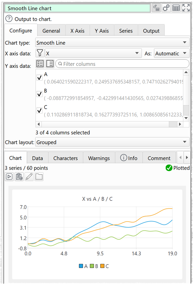
Set X axis data to the column you want to use for the X axis data. The X axis data can be interpreted as numerical, date or text/categories/labels, depending on the chart type.
Set Y axis data to the column(s) you want to use for the Y axis data. The Y axis data is interpreted as numerical.
If you are displaying multiple data series, you can use Chart Layout to plot them Grouped, Faceted or Stacked.
 Grouped
 Stacked (each series is summed with previous series)
 Faceted (each series displayed separately in a grid)
You can display up to 5 facets across x 5 facets down.
General tabSet the Theme drop-down to choose a palette of colors.
 Light theme
 Natural Color System theme
 Ice Blue theme
 Dark Blue theme
 Green theme
 Brown theme
 Dark theme
Set Text to modify the chart title text and visibility. If you set Title to Custom the column variables $(X) and $(Y) will be replaced with the names of the X and Y columns. This is particularly useful if you have multiple facets.
Set Legend to modify the legend position and visibility.
X Axis tabX axis options available depend on the Chart Type selected.
Y Axis tabY axis options available depend on the Chart Type selected.
Series tabSeries options available depend on the Chart Type selected.
Output tabCheck write to file if you want to output the chart to file each time it is updated. Easy Data Transform will attempt to overwrite any existing file with the same location.
Set File to the location you want to output an image file to. This can include File name variables, e.g. to change the image file name based on the name of an input file or the current date.
Set Type to the image file format you want output. PNG, JPEG and PDF formats are supported.
Set Size to the dimensions of the image. This is a paper size for PDF, and width and height (in pixels) for PNG and JPEG.
Set Orientation to Portrait or Landscape. Only available if PDF is selected for Type.
Set Resolution to set the resolution of the PDF file (in dots per inch). Only available if PDF is selected for Type.
Use Alias to identify the file for batch processing or command line processing.
Notes•Easy Data Transform plots your data 'as is', without much additional processing. However you can use various transforms to process your data into pretty much any form you want it. For example: Bin, Dedupe, Reorder Cols, Sample, Scale and Sort. •The Mac Preview application does not correctly display gradients in PDFs. Use Google Chrome or a PDF viewer to view PDFs with gradients.
See also•How do I plot relative values?
|


