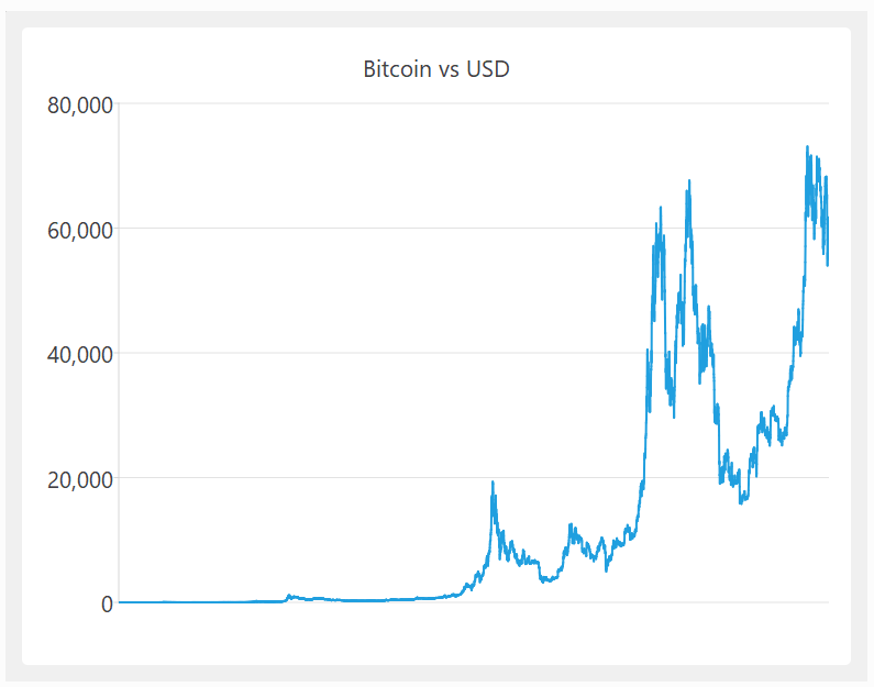
Humans brains are highly developed for visual processing. A list of 5000 dates and numbers is not easy to understand, but the equivalent chart can be understood at a glance:
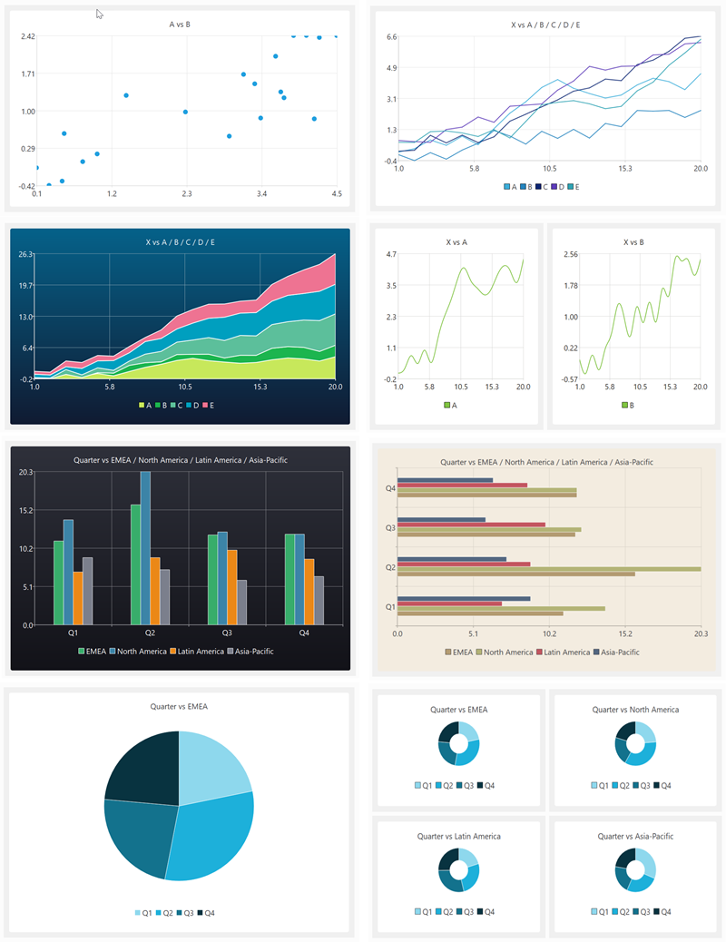
Data visualization is fully integrated into Easy Data Transform Advanced edition, with the following chart types:
- scatter chart
- line chart
- smoothed line chart
- area chart
- vertical bar chart
- horizontal bar chart
- pie chart
- donut chart
To add a chart, just select an Input or Transform item in the Center pane and click the To Chart at the bottom of the Left pane:

If you can’t see the To Chart button:
- Make sure you have v2.11.0 or later installed.
- Select Advanced Edition in the Edition tab of the Preferences window.
With the newly created Chart item selected in the Center pane, choose in the Right pane:
- the Chart type
- the column with the X axis data (the column data can be text, date or numeric)
- the column(s) with the Y axis data (the column data should be numeric)
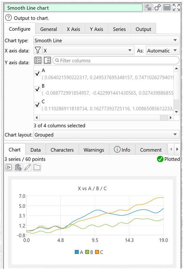
You can then choose from a wide range of options to customize the chart to your requirements (title, legend, axes, linear/logarithmic, colors, layout etc).
Here are some sample charts, generated in a few clicks:
Charts can be output in PNG, JPEG or PDF format and are fully integrated into command line and batch processing. This means you can convert hundreds or thousands of data files to charts in a single operation.
See the video above for more details and examples.
As well as visualization, Easy Data Transform can help with cleaning, filtering, blending and profiling your data. All without coding. Data transformation and visualization, tightly integrated together, is a powerful combination. Download the free trial and try it yourself.
 Windows Download
 Mac Download